Pomodoro App Creation Process
A quick look into my process building a simple pomodoro app.
Pomodoro Technique: “The Pomodoro Technique is a time management method developed by Francesco Cirillo in the late 1980s. The technique uses a timer to break down work into intervals, traditionally 25 minutes in length, separated by short breaks.” -Wikipedia- Pomodoro Technique
The idea
I came across a wonderful online Pomodoro Tool the other day. I’ve spent the past few months dedicated to developing my app Iconstructor, so when I saw this I thought it would be fun to take a break for a few days and create my take on a Pomodoro-style time management app.

The design process
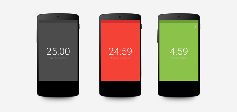
What I really liked about the oGabriel’s pomodoro clock was the simplicity. There’s a million pomodoro apps online and available on Android, but every single one I have tried fills the UI with weird skeuomorphic design or clock overlays or settings. I thought I could take the essence of the online tool, the use of background colors to represent state and text to show time remaining, and turn it into my version of the app.
My first iteration (see below) was a fairly high fidelity mockup that I put together in Inkscape. I decided to stick to the core android-style appearance, using default fonts in various weights, a simple overflow menu in the top right to access settings, and a color scheme recommended by the material design style guide. No branding, no chrome, no ads, just a timer at it’s core.

I built on the first design, making a few minor tweaks, and put together a whole array of images representing the app at its various states. All in all, it couldn’t have taken me more than an hour, but I now had something to follow going into the app building process.

What I changed
One of my big changes was that I added a settings page to the app. I think it would have been cleaner and excluding it would have probably made the app more effective (in my personal experience- the more customization an app offers, the less I use its core features), but having made apps before I instinctively try to take the One of my big changes was that I added a settings page to the app. I think it would have been cleaner and excluding it would have probably made the app more effective (in my personal experience- the more customization an app offers, the less I use its core features), but having made apps before I instinctively try to take the path which results in the least complaints. path which results in the least complaints.
I also decided to change the text suggestions under the countdown depending on whether the app is in work or break mode. In my opinion this change improves clarity by a bit without adding any new complexity (on the user or developer end) or confusion.
Another thing that I changed from the online tool is that I removed the inactive state. I thought it added an unnecessary level of complexity to the building of the app despite not adding any clear benefit.
The last change I made came after testing it for a while. I decided to add a ripple effect to clicks to make the responses clear, because at times without it I had vague doubts that I had actually restarted the timer.