Inkplayer- My Music Player App
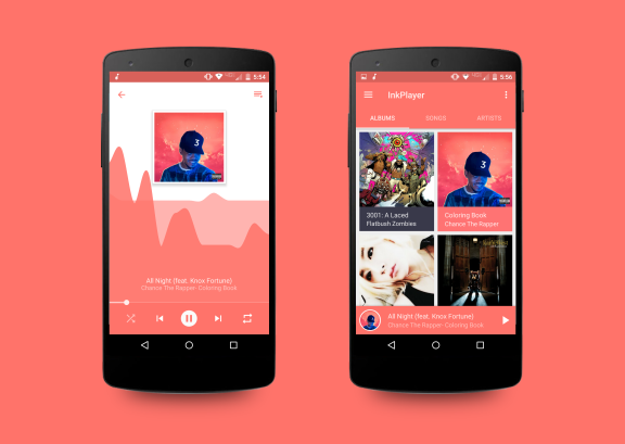
A look at the music player app I’ve been working on.
Why?
After finishing up my Pomodoro app I decided I wanted to take on a bigger challenge. I thought to the apps which I use regularly and decided that as much as I liked my current music app, I would love one with a fresh take on the design aspect. I focused the design of the “currently playing song” screen in particular because I thought that was the area which had the largest room for improvement. Other apps following standard Android design trends with their main screens but the “now playing” screen was the place that I saw had the largest room for creative divergence.
Step 1: Ideation
Since my #1 goal was to design an app with a focus on visuals, I spent a long time cycling through designs. I doodled in the margins of my notes (I wish I had kept these to show here) for a few weeks to get my ideas out. I started out with about as minimal as a design as I could: no colors, small controls, and basic typography.
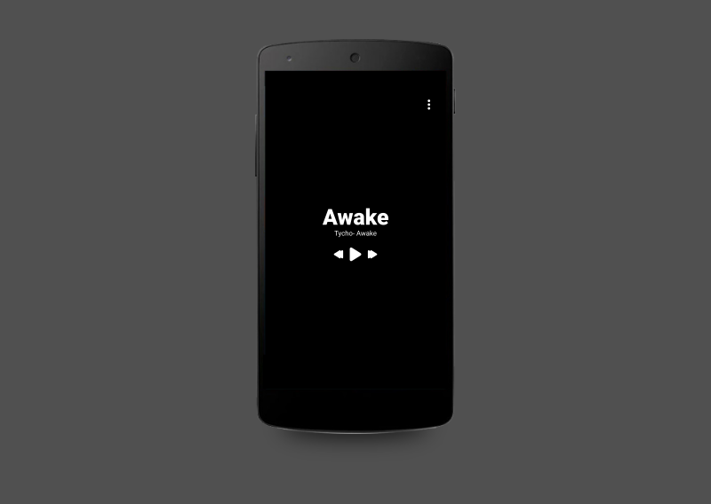
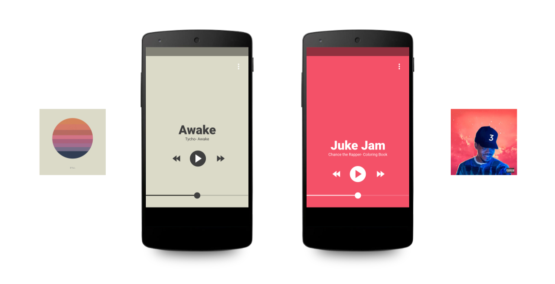
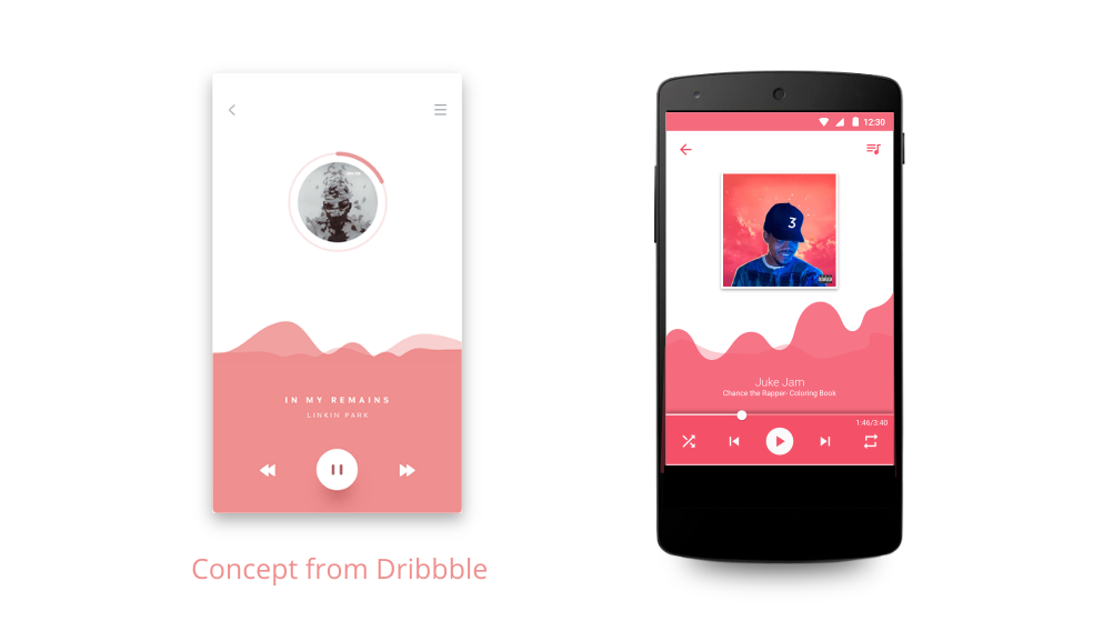
I slowly evolved the idea, basing on what I had and adding parts from similar apps or mockups online. I added my own elements, however. One of the ideas that I liked the most was basing the apps UI on the color of the album art from the currently playing song. This was the app felt like it was customized just for your personal songs.
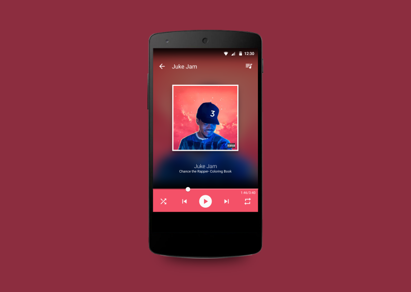
After I had my basic ideas down, I then had to update the UI to conform with normal Android app standards. Using a standard control scheme, a little bit of typography and some cool background images I turned the app from a basic concept to something worth working on.
Reflection
I wouldn’t have been happy just finishing with some pretty designs on my computer, so I went ahead and spent a month or so developing the app. Having recently gotten it to be stable to use as my main personal music playing app, I’ll be launching it on the Play Store (and possibly open sourcing it) sometime in the coming weeks. Check out the video demo below!